Week 5 with Jadu Fellowship Program
Hello, Good Evening! Here I am again with another Weekly Blog. If you have been reading my previous blogs, you might already know that I am currently a part of the Jadu Fellowship Program and this was the end of Week 5.
A lot has happened throughout this week. But I would start with them one-by-one.
Interactive Live Session
Well in this week, we had our very first interactive session where we all shared our ideas and thoughts with other fellow members. It was full of fun! I learned so many things about other members. Everybody was very professional and mature. It was a very pleasant experience.
Responsive Web Design Project
The second most exciting thing that happened this week was this week’s project. We were given the desktop and mobile designs of a web page and we had to make a responsive web page according to those designs. The textual content and images were provided, but there was no HTML markup or styling. We have to make all that on our own, and the condition was that we have to use CSS grid or flexbox to make it responsive on desktop and mobile devices.
When I saw the designs, I started figuring out how this can be done. In the first attempt, I built it using CSS flexbox. I know that might seem simple but it wasn’t so simple for me. But still, I managed to do it in a relatively short time!
But then I started feeling curious if I could make it using both CSS Grid and Flexbox. So I started working on that, but that’s when things started to get very confusing. The thing is, I am not very good at making responsive designs. Maybe that’s because of my lack of experience with them. That’s why I felt kind of lost, figuring out ways to get it done.
The goal for me was that I wanted to minimize the code inside each CSS Media Query and share as much code between desktop and mobile views as possible. So I got out of my comfort zone and tried very hard to get it all done. And finally, in the end, this is what I built:

It was a very fun experience. I have learned a lot about CSS grid and flexbox, and now I can use them very confidently in my projects!
Started Learning JavaScript
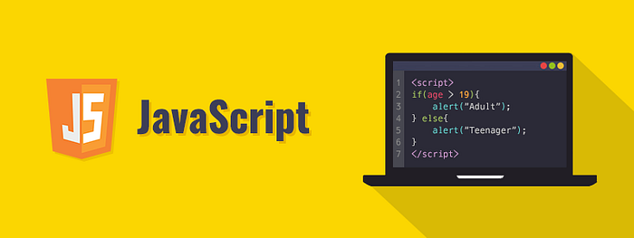
Apart from that, we also started our discussion on JavaScript. If you have some web development experience, you would probably know that JavaScript is the soul of every modern web application. That’s why it is essential to learn JavaScript, especially if you are learning web application development.
We started with the basics of JavaScript, and then we moved our way up to some intermediate stuff. We learned about different control structures and operators, loops, arrays, and objects. We also learned about variable scoping and some other cool things as well.
I knew some basics of JavaScript before that. It has a very similar syntax to c/c++, java, etc. But there were some things that I didn’t know about, for example, the difference between the local and block-level scope of variables. I enjoyed learning these things. These were very informative sessions, overall!


